The term 'flat design' is often thrown around in the web design community but I've seen the trend creeping in to print design, architecture and fashion too. It would appear that this flat design thing ain't no fad! On the surface, it's a wonderful thing; clean shapes, splashes of vibrant or at least well considered colour and the eradication of skeuomorphism - AKA - the nasty faux shadows and textures we've long been subjected to. Without a doubt, designs like these have been most prevalent in the world of UI and web design, but it is through user interfaces that the surface of this trend gets peeled back and we get to peer into the real soul of this thing.
But let me track back a bit here! Where did this trend appear from and why are people using it? The answers to these questions aren't simple. The birth of flat design could be traced back to any number of places and I would even argue that flat design principles have long been at work in the world of print design - best exemplified by 'Swiss Style' graphic design which came about in the 1950s - some four decades before the invention of the 'world wide web'!
I think it is easier to describe the 'why'. The answer is 'humans'! Half of us are fickle creatures who are easily bored and the other half are tireless innovators who are easily bored! In cinema, film-making trends are referred to as 'new waves' and are born out of disillusion for the status quo, and are often driven by young and restless artists. In politics, when people get fed up of their governments they revolt and turf out the old figureheads and appoint new leaders under new political structures. When relationships start to break down, we get divorced and date people half our age! Where was I going with this?! Oh yes... we get bored and we seek out the next big thing. That's just our nature!!
The cinematic new waves analogy works best because these movements aren't forced or planned - they just happen organically. And that's the same with design trends (not to be confused with nasty fads), and the explosion of flat design is no different. Since its inception the world wide web has been dictating to us what is what by imitating life. Can you click it? Then it needs to be coloured and underlined or if it's a button it needs to look like a big bevelled blob just so we don't get confused. But most of us have been using the web since the mid nineties and we've kind of got the picture! Flat design bins off all of the imitations of old and instead gives us clean, flat interfaces which are a joy to interact with... or are they?!
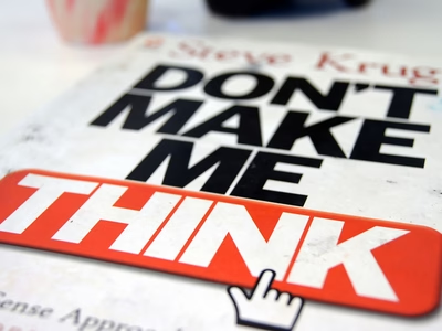
Most UI/UX designers will be familiar with Steve Krug and his industry gospel 'Don't Make Me Think'. His teachings are absolutely impossible to argue with. A website or app or any user interface should simply not make a user think. If something is unclear or difficult to navigate then it is a design fail. So is flat design, which essentially removes all traditional indication that an object is click-able or interactive, actually anti UX? Well... not quite! You see, the clue is in the word 'traditional'. In flat design a button is still a button, just without the frilly bits. It's still a big, bright and colourful blob which is obviously a button so what's the big deal? Hover states. That's the big deal! Traditionally we've relied on hover states to reinforce that element of interactivity and then we went and invented smart devices that have touch screens and don't have hover states! This is where I find it particularly surprising that people argue that the best place for flat design is on mobile. The load times on flat design websites tends to be quicker which is suitable for mobile devices, but when removing the ability to hover, I really do start to question if flat design is the right format for these devices?

