Four female hurdle sprinters are leaping over the hurdles along the race track.

Responsive Design Part 4: Overcoming the drawbacks of responsive

25 Jan 2016

Darren Fisher - Developer and Consultant

Written by
Darren Fisher
Developer and Consultant

For the past few weeks you may have noticed we've been focused on responsive website design. We've talked about what it is, why you need it and discussed some examples of when good sites go bad. To round off, it's only fair we discuss some of the drawbacks of responsive design… if indeed there are any.

A middle aged man with blonde hair despairs with his hand over his face.

What drawbacks?

Perhaps it would be fairer to say that this week, we'll be discussing how we can prevent poor responsiveness by thinking ahead and planning properly.

Often, when discussing the drawbacks of a particular technology we forget that perhaps we're just doing it wrong or we haven't considered an alternative way to solve a complex problem because we're all stubborn little creatures of habit and we love to cut corners where we can.

We're just humans after all and humans are fundamentally flawed!

Here are just some complaints that we've heard about responsive website design and a brief explanation as to how these gripes can be overcome.

When I've used mobile sites there is always stuff from the desktop site that goes missing. The functionality that's key to my site just won't work on a smaller screen!

If you've seen a website where a critical piece of functionality is removed entirely for smaller devices, then that's just plain lazy.

Functionality should never just disappear because somebody couldn't be bothered to put some thought and planning into how that functionality should alter for different devices.

This stuff is vital to face head on in the planning stage, and you need to know the value of each piece of your content and functionality. Don't be tempted to put your head in the sand.

Remember - as we've explained earlier in this series - over half of web searches on Google are now done on mobile devices. So this is where your client is now more likely to find you, and experience your site for the first time.

My website has pixel perfect text lockups that use custom fonts. I've heard these don't work responsively as they require fixed pixels to display correctly. To have lockups display dynamically and respond to different screen sizes I'd need to replace them with images, but that will be bad for my SEO rankings with Google, and for general accessibility and usability.

Okay so this is a niche problem, more specific to very design-heavy companies who are used to controlling print layouts... and it may not be relevant to some of you reading this, but we've got an answer all the same.

For the uninitiated, text 'lockups' are those beautiful typography designs you commonly see in print and fashion but unfortunately their journey to the web has often been risky and unsuccessful.

But if it is something you're worried about losing with a responsive website... the solution lies in using SVG images. This gives you all of the control of using an image, but all of the SEO benefits of using actual text, plus you'll benefit from the lossless vector quality of the format. If you need to know more check out this fantastic 'Creating a Web Type Lockup' tutorial.

Maps are horrible on mobile devices. A phone screen is just too small to interact with anything on a map.

Maps are tricky blighters on smaller screen; that much is true. But you only have to look at the map apps that are out there to see what is achievable at mobile screen sizes.

Plotting points all over the world and trying to display that with any sense on a mobile can easily get messy but with thought, care and planning it can still work.

There's nothing “unresponsive” about pinching and zooming on something as fundamentally scalable as a map, if the user experience and user journey requires it.

So don't fall into the first camp and assume maps just have to be removed - especially if they are key to your site's functionality. Maps take a lot of consideration in terms of usability, but there is no reason you can't provide map functionality for all device sizes.

My images are super wide which looks great on my laptop but wouldn't be viewable on a mobile device.

Super wide images are great for desktop machines and laptops (or any device that is being held horizontally) but when you shift the screen to a portrait orientation things can look very odd very quickly.

Fortunately using nifty ninja coder tricks good designers will be able to change the aspect ratio of images for different device breakpoints and even change images entirely if that is more appropriate (for example, using a 'piece' of the image which is beautifully cropped and aligned for each 'breakpoint').

We mentioned earlier in the series how JavaScript can be used to replace a video background with an image on a mobile device to save data. The same technology can be used to change images dynamically for different breakpoints as well! Magic.

Two road signs - one pointing to success and the other pointing to failure.

If you fail to plan then you plan to fail

It all comes down to the age old Dad-saying. If you fail to plan then you plan to fail.

If all your responsive requirements are considered early on, then none of this stuff should cause you any issues. It's just about making the right decisions. Designing for different device sizes is like dealing with completely separate designs except that all of the elements are the same and need to flow in the same order despite the changes in orientation and size. This is why it is best to plan for all device sizes, for all components right from the get go. And even if you're working with an existing 'unresponsive' design, you'll need to make different decisions for different 'breakpoints', and this may have some repercussions for your existing desktop screen sizes.

It's all about creating positive experiences for your users - making your site's information and functionality available in a way that makes sense, regardless of the 'viewport' they're viewing it through. It takes proper thought and planning - but a lot of this heavy lifting can be done up front, provided you understand the trade-offs. Don't let it get to launch day before you user test your brand new, supposedly responsive site, and get a shock when things don't work as they should.

Do the proper planning. Have the right discussions early on. Know what decisions you need to make, by knowing what questions to ask of your web agency. Empower yourself.

A pile of British money.

You get what you pay for

Yes - it's an investment to design for responsive considerations. But don't be fooled - it's a false economy and a big mistake to think 'I'll just get my site out there for now to limit the spend, and deal with responsive later'. There are a lot of web agencies out there who will simply take your money and just deliver what they're told to, even if you don't really know what you're asking. But if you are really serious about succeeding online in this day and age, then you need to be super serious about budgeting for a responsive site, and having a web team who can help you ask the right questions, and will even challenge you to justify your answers.

A static Photoshop design made into a website at an average desktop screen size, just doesn't cut it anymore. You need to see how elements will flow for different devices and whether there are any oddities in the re-stack of elements for different devices. These things take consideration, care and of course - time and budget. But allow for this now as part of your build, and you won't be tearing down and throwing your site away in 12 months time in order to spend money rebuilding it again, because you've lost search engine ranking, customers, and profits.

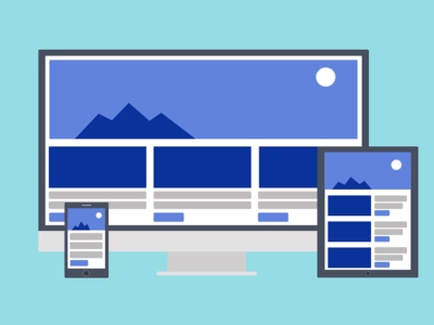
An illustration of a responsive website on a large desktop machine, a tablet and a smart phone.

Conclusion

Well... what a start to 2016.

In the last four weeks we've covered a whole lot about responsive website design and to be honest we've still only really scratched the surface.

There are new innovations and best practises surfacing everyday, both technologically and creatively, and the landscape just keeps evolving.

With the continuous arrival of new devices one thing is for sure… responsive website design is going to keep evolving and getting better and better. So don't risk being left behind - get involved, and do it now!

And if you think you need our help then don't hesitate to get in touch to discuss how we might be able to help you.

Darren Fisher - Designer & Developer

Get in touch about your project

Give us a call or send us an email to talk through your project

telephone+44 (0) 203 743 0886

emaildarren.fisher@pivale.co

Articles in this series

Related articles

The Sass and CSS 3 logos offset in a pattern across a design grid.

Using Sass and CSS3 Flex as a grid system

Calendar 3 Apr 2017 #Frontend #Tutorial #HTML, CSS & Javascript We used to be big fans of using singularity to create responsive grids on which to craft our web layouts but we've been converted to CSS3 flex and here's why!

Read the article
An ape looking perplexed with one hand placed on its head.

From Print to Web: The journey of a 20th century Graphic Designer

Calendar 3 Mar 2015 #Insights #Frontend Six months ago our digital designer Darren was a stuck-in-a-rut print designer, utterly unaware of the opportunity that lurked just around the corner.

Read the article
A boy looking very confused and scratching his head.

What is Pattern Lab and why should I care about it?

Calendar 11 Sep 2018 #Insights #Frontend Our front-end developer discusses why you and your business should be considering Pattern Lab for your next Drupal project.

Read the article

More recent articles

Bundles of Euro bank notes overlaid by handcuffs and a sinister sillouetted character on the left.

Google Analytics: Is it legal?

Calendar 24 Nov 2022 #Insights #Advice #Security & compliance Promise: not clickbait! It's hard to believe that this popular product could be considered illegal.

Read the article
A girl grimacing in disgust.

What to consider when you're thinking about your webforms

Calendar 3 Nov 2022 #Insights #Advice Webforms are a great way to consolidate interest and turn your visitors into potential new customers. But we bet you hadn't considered the power, positive and negative, that a webform can have on your potential new customer's experience of your business.

Read the article
The ruins of a building in the middle of a field.

6 reasons not to use a standalone microsite for your Christmas marketing campaign

Calendar 27 Oct 2022 #Insights #Advice #Security & compliance #SEO We've compiled a list of the six reasons businesses shouldn't entertain the thought of a microsite - and they're pretty compelling.

Read the article

Subscribe for email updates

1 Your details

2 Your interests

Please select which Pivale services are of interest to you:

3 Legal info

By subscribing, you acknowledge that your information will be transferred to our marketing platform for processing.

You can unsubscribe at any time by clicking the link in the footer of our emails. You can find out more in our privacy policy.