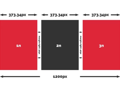
We used to base all of our responsive design work on the singularity framework which utilised CSS floats to achieve a grid that could be manipulated at different breakpoints to suit multiple devices. There were many niggles with using this system - and none of them were to do with Singularity itself and more to do with CSS floats which for the most part always seemed to be the wrong approach - a little bit like using HTML tables for layout back in the good old days.
Now, there are whispers on the winds that a grid system is coming directly to CSS - but until such time as these initiatives become production-ready what were we to do?
With the arrive of flex in CSS3, layouts are now a joy to achieve but they still don't quite form a grid system. However, using Sass combined with the power of some of the latest CSS3 technology we can make our own grid system quite easily and I wanted to share my grid system with you in the spirit of open source.
Pre-warning: a decent level of understanding of Sass and CSS3 will be required to understand and utilise this information.
The method
You'll need to have a project up and running with Sass (SCSS) and will hopefully have a variables folder with some Sass partials in it. In your 'variables' directory add a new sass partial and call it something like "_gutters.scss". Open the file and add a variable so that we have a gutter (width of your choice) to work with. The sass will look something like this:
$gutter-width: 40px;
Now that we have a gutter width stored in a variable (so that we can easily change it later if required) we can move on to setting up the grid framework. This is done via a sass mixin. Personally I store my mixings in the 'abstractions' directory but you may have your own preference. The main thing is to make sure that your mixins are the first thing that are compiled before you start working on any production code. So in my 'abstractions' directory I'll create another sass partial and call it something like "_mixins.scss". Open the file and create a mixin:
@mixin grid-span($columns) {
$gutters: ($columns - 1);
flex-basis: calc((100% / #{$columns}) - ((#{$gutter-width} * #{$gutters}) / #{$columns}));
flex-grow: 0;
flex-shrink: 0;
width: calc((100% / #{$columns}) - ((#{$gutter-width} * #{$gutters}) / #{$columns}));
}
Whoa?!?! What the heck is going on here? If this looks utterly alien to you - never fear. I'll explain what's going on here.
Firstly we've created a mixin (a block of code which we can use again and again by entering a variable. First of all let me give you an example of how we would call this code:
.foo {
display: flex;
.bar {
@include grid-span(3);
margin-right: $gutter-width;
&:nth-child(3n) {
margin-right: 0;
}
&:last-child {
margin-right: 0;
}
}
}
What this is doing is telling the parent wrapper that we want to display flex which then makes all child items 'flex items'. This allows us to give them flex properties that make them behave in a grid like format but filling these properties out time and time again is frustrating and not time-efficient.
So, enter our mixin. As you can see we called the mixing using the code:
@include grid-span(3);
What this is doing is saying we want to include the code we've written in our mixin and to pass the value of three to the variable within the mixin. So let's show what that would look like in static code:
@mixin grid-span(3) {
$gutters: (3 - 1);
flex-basis: calc((100% / 3) - ((#{$gutter-width} * #{$gutters}) / 3));
flex-grow: 0;
flex-shrink: 0;
width: calc((100% / 3) - ((#{$gutter-width} * #{$gutters}) / 3));
}
Hopefully this is now looking less scary. Now we've passed '3' as a value to the $columns variable we will also have a fixed value for the $gutters variable as this is formed of a calculation which subtracts 1 from the $columns value. We also defined our $gutter-width variable so we can swap that out for a value and start to make sense of what's happening inside this mixin:
@mixin grid-span(3) {
$gutters: (3 - 1);
flex-basis: calc((100% / 3) - ((40px * 2) / 3));
flex-grow: 0;
flex-shrink: 0;
width: calc((100% / 3) - ((40px * 2) / 3));
}
So now the mixin has all the values it needs and in sass we'd now be looking at this if we'd written this statically:
.foo {
display: flex;
.bar {
flex-basis: calc((100% / 3) - ((40px * 2) / 3));
flex-grow: 0;
flex-shrink: 0;
margin-right: 40px;
width: calc((100% / 3) - ((40px * 2) / 3));
&:nth-child(3n) {
margin-right: 0;
}
&:last-child {
margin-right: 0;
}
}
}
So let's tackle the calculation so we know what's happening:
Calc 1
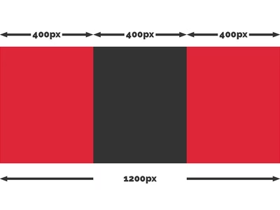
100% (eg. a 1200px container) ÷ 3 (number of columns) = 400px
Calc 2a
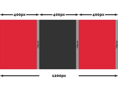
40px (gutter width) x 2 (number of gutters) = 80px
Calc 2b
80px (total sum of gutter widths) ÷ 3 (number of columns) = 26.66px
Calc 3
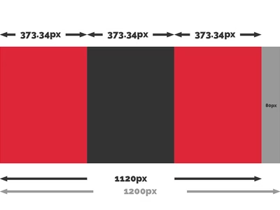
400px - 26.66px = 373.34px
Working backwards to check
So our child elements are given a width of 373.34px. If we do 373.34px multiplied by 3 we get 1120* and then if we add our total sum for the gutters which is 80px we end up back at 1200px!
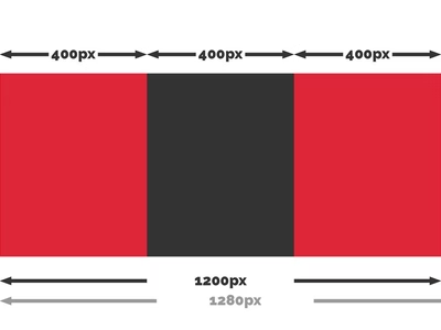
*Rounded by browser to whole figure.
Guttery biscuit base
The gutters are added by the following code:
margin-right: 40px;
&:nth-child(3n) {
margin-right: 0;
}
&:last-child {
margin-right: 0;
}
This tells every child element to have a margin-right of 40px unless they are a multiple of 3 (the last column in the row) or the very last child (in case we want to do some funky central alignment trickery!
Browser oddities
The keen-eyed will be asking the question:
Why on earth are we implementing a flex-basis and fixed width value that are exactly the same?
Come on! You know the answer. It's not just internet explorer either! Edge, Safari and Firefox all have rendering oddities when it comes to using flex and calc in combination. The safest way to have this render properly in every browser is to include both flex-basis and width at the same time.
I can also hear those in the know groaning about this bit of code:
flex-basis: calc((100% / #{$columns}) - ((#{$gutter-width} * #{$gutters}) / #{$columns}));
flex-grow: 0;
flex-shrink: 0;
The recommended syntax is the short-hand version which would look like this:
flex: 0, 0, calc((100% / #{$columns}) - ((#{$gutter-width} * #{$gutters}) / #{$columns}));
But once again, guess what? IE and Edge don't currently support the flex shorthand and render all over the place.
The good news is that we're using a mixin so when the day comes that flex renders in a standard cross-browser fashion we can jump in to the mixin and remove the bloat and re-compile in a matter of seconds!
Long live Sass
The beauty of all of this is that as browser compatibility improves we can keep hopping in and amending this mixin without spending hours testing (providing we always call the mixin rather than writing the raw code).
I hope I've broken this down in a way that makes sense and is helpful to anyone who stumbles across this post. If you have any questions or suggestions please let me know in the comments below.
Until next time, you sassy flexy bunch.